It's been a great month for new maps. Not all of them were published this month, but several started getting some of the attention they deserve.
Authagraph
First off, there was Authagraph,
Japanese architect Hajime Narukawa's award-winning method of mapping the globe to a flat rectangle that
preserves the true relative sizes and shapes of the continents. It's a
remarkable achievement. The article "
It’s Not a New Earth, Just a New Perspective: AuthaGraph World Map’s Accurate View" by
Tamar Melike Tegün in
Interesting Engineering does a nice job of reminding us of some of the other attempts to lay out a spherical globe on a flat surface and of sketching the steps involved in creating this new map. Remember Antarctica appearing enormous along the bottom of many map projections? Remember Greenland looking enormous and Africa more-or-less South America's size? Look again.
Maps of Animal Movement
The National Geographic highlighted some amazing maps of animal movement in the article "These Beautiful Maps Reveal the Secret Lives of Animals" by Greg Miller. All present data gathered from tracking sensors. Some of these maps (like the one at right showing the spiral path of a griffon vulture as it riding updrafts high into the air in its search for food) show us just minutes of movement. Others show months of data on migratory or just plain long-term wandering patterns for baboons, Australian crocodiles, grey-headed albatrosses, jaguars, and more. Nature films do a wonderful job of showing the daily lives of animals and hinting at their daily, seasonal, or yearly movements. These maps foreground those movements in beautifully diverse ways.
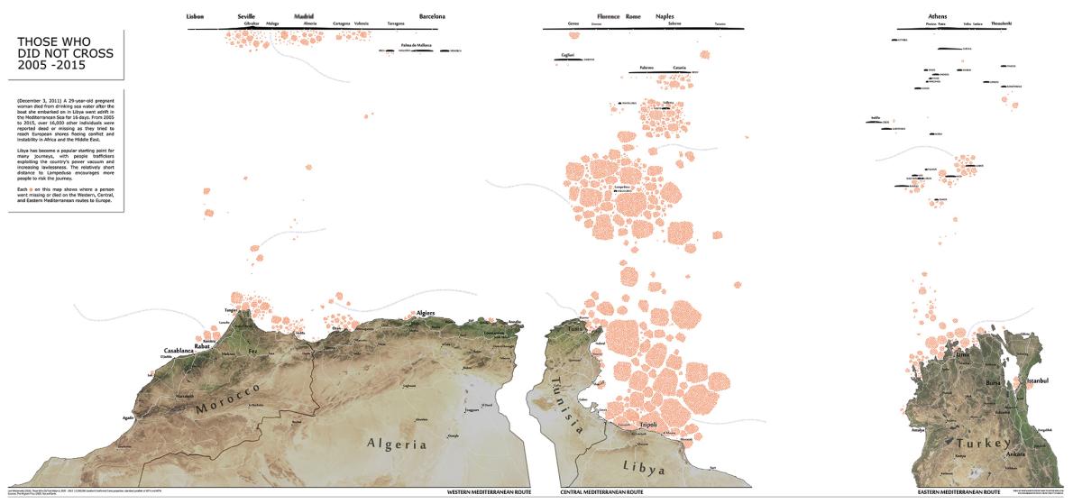
Best New Maps, According to Cartographers
The article, "Best New Maps, According to Cartographers" by Betsy Mason in National Geographic gives a taste of some of the 32 extraordinary maps in volume 3 of Atlas of Design, published by the North American Cartographic Information Society (NACIS). Some show new ways to use satellite imagery to create better maps of what we've seen before (like "Denali and the Alaskan Range"), while others map what we've been told about but never seen, like this map to the left. It shows where in the Mediterranean each person who died or disappeared trying to reach Europe from Africa or the Middle East. Mason also shows us a retro map of natural resources in the US, a wonderful, data-rich map of elk migrations and more in Yellowstone National Park, and a map of mythic monsters claimed by each state in the US.


No comments:
Post a Comment